27 Dec Started from the Bottom
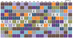
In our industry we are constantly exposed to charts that illustrate trends and statistics. One of the more interesting charts that we review every year is the Callan Periodic Table of Investment Returns (Think high school chemistry). The “Callan” Chart was first published in 1999 and resembles Mendeleev’s periodic table of the elements. This chart shows relative returns for different asset classes and ranks them from best to worst over a given time period. Our partners at JP Morgan put their own renditions together by including an asset allocation class. As you can see from the chart below, it is intuitive to read and provides useful historical data.

The “rankings” change every year and illustrate several key principles of investing:
Diversification: Very rarely does one asset class consistently outperform the others or stay at the top for an extended period of time. The chart illustrates the importance of diversification across asset classes (stocks versus bonds), investment styles (growth versus value), capitalizations (large versus small) and equity markets (U.S. versus international). As no one has a crystal ball, by owning an asset allocated portfolio with exposure to the entire market (all asset classes) you minimize the susceptibility to sharp changes in market variations.
Past performance does not predict future performance: Just like high waisted jeans in made a splash in the 80s and have re-emerged today, asset classes go in and out of favor. One year emerging market equites are the top performing asset class the next year they are worst. While you can try to identify patterns, the exercise is futile.
Over the long term asset class performance tends to revert to the mean: Asset classes have periods of strength and weakness. Mean reversion is the theory that suggests investments can trade above or below their long-term average returns for periods of time, but eventually they are likely to move back towards their average. Outperformance is followed by underperformance and vice versa. The problem is that those extended periods of time can be months or years. No one can accurately predict the duration of deviation from the mean.
Another observation in the Callan chart is a historical perspective of asset classes. Leading up to the financial crisis, Real Estate Income Trust (REITs), emerging markets equities, and commodities led the pack. If you recall, real estate valuations were at the heart of the crisis, emerging markets were fueled by China’s artificial demand which subsequently drove commodity prices. Then the bubble burst. During the financial crisis in 2008 fixed income was the top performing asset class with a 5.2% return. This makes sense as the global markets were imploding investors exhibited a “flight to safety” in bonds. The move pushed interest rates lower and bond prices higher.
In the following year, 2009, after we introduced quantitative easing to shore up the markets and regain confidence, fixed income and equity markets rebounded with one of the best years on record. Emerging markets equities were up 79% along with most asset classes displaying double digit returns. The real estate market was slower to rebound, but from 2010-2012 REITs gained the top spot as interest rates remained accommodative, labor markets recovered, and market sentiment improved.
In times of uncertainty and new normals, the best offense is a good defense.
In recent years we have seen a slowing China, the potential of higher interest rates, and valuations that are slightly above historical averages. All of these factors have weighed on commodities and emerging markets. For the past 3 years commodities have been the worst performing asset class. This has never happened in the past 15 years although we have been on a bull run that would impress any market historian. This fuels the contrarians in us to believe that commodities may be due for a comeback.
Unfortunately, with the bull market come the bears and the likelihood for markets to experience a significant correction. Markets cannot constantly go up without some sort of pause or consolidation. This reality along with the growing pessimism has led to muted returns this year. The top performing asset class is up only 2.7%! Even in the worst financial crisis of our time, fixed income was able to return 5.2%. Is this a sign of further weakness to come? Should we expect muted returns in the future? Is this the new normal? Has the pendulum swung too far?
Simple answer – we don’t know. In times of uncertainty and new normals, the best offense is a good defense. Maintaining a diversified portfolio, rebalancing, and focusing on your long term goals will help you with the ups and downs. We must remain cognizant of the current market environment and invest strategically – and watch out, the mustache might be due for a comeback!


